
Orion® Platform Redesign
After the redesign we asked our users: “If Orion was a car, what kind of car it would be?” They said, Tesla Model S.
Problem definition
Look and feel of Orion® (IT monitoring suite) is outdated. No shared and reusable library of UI elements and solutions leads to inconsistent look and feel. Old technology stack and lots of technical debt. Updates of specific UI elements does not automatically cascade through all modules. Each implementation is unique. The Orion Platform does not have full control over UI elements because modules (individual products) often modify its code. Developers and designers are referring to UI elements and solutions by different names which leads to confusion and inefficiency.
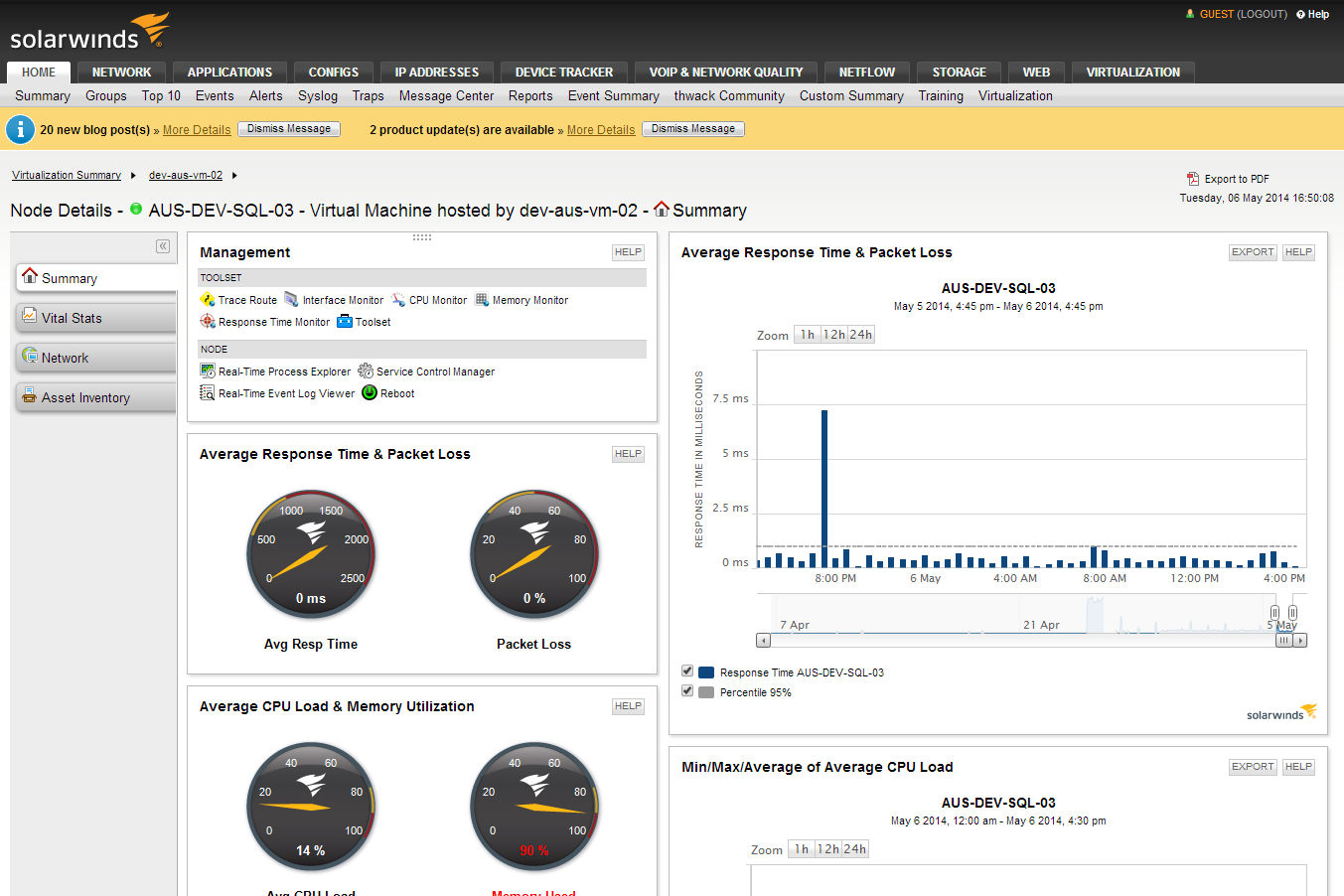
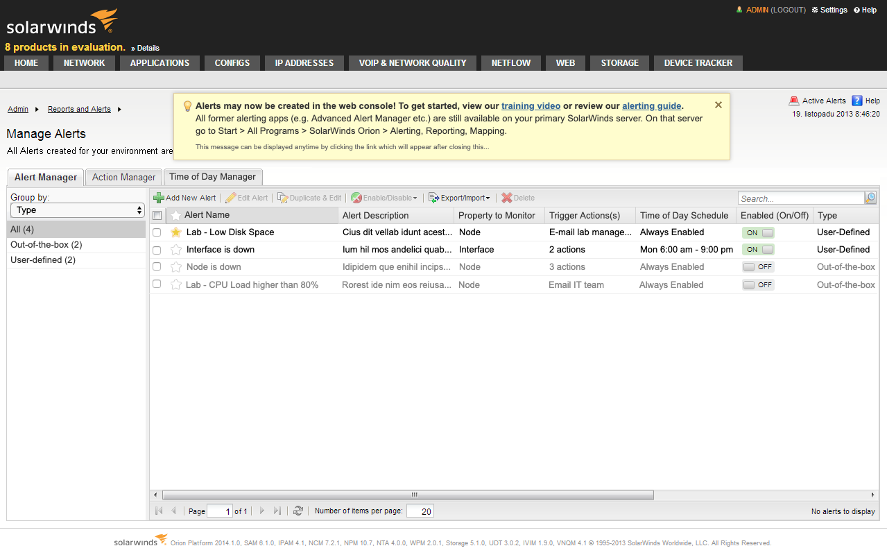
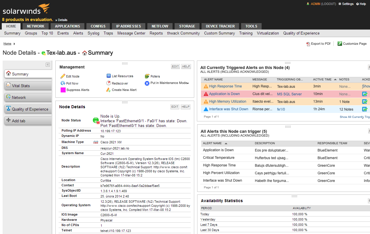
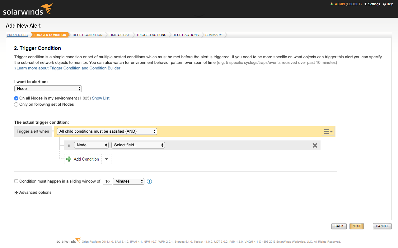
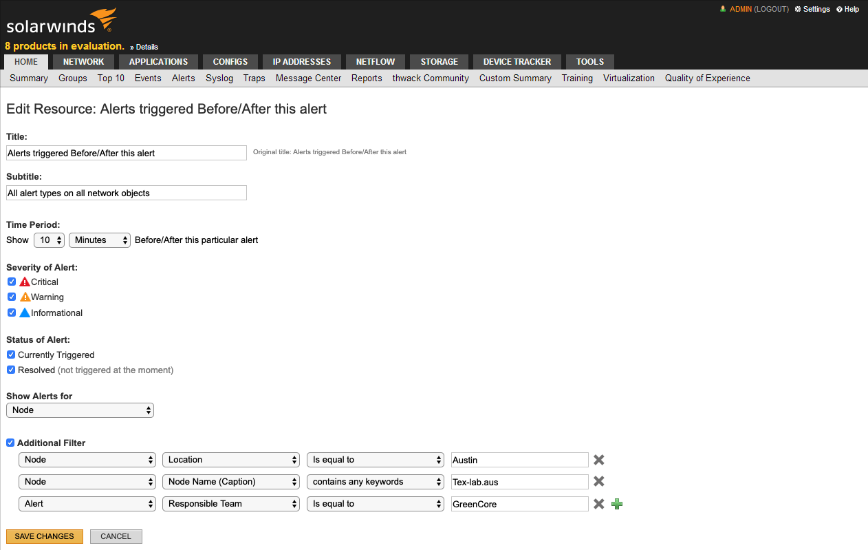

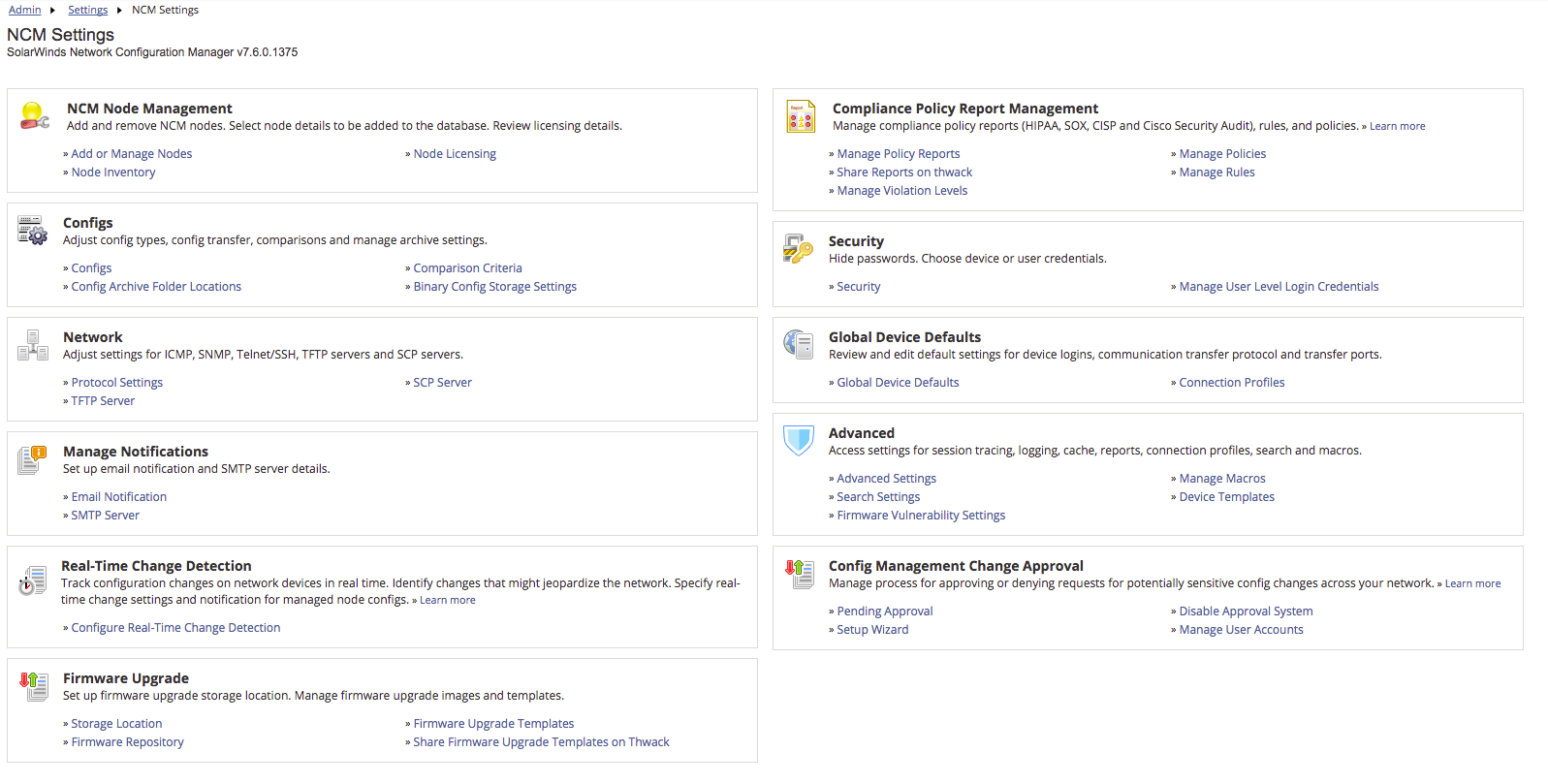
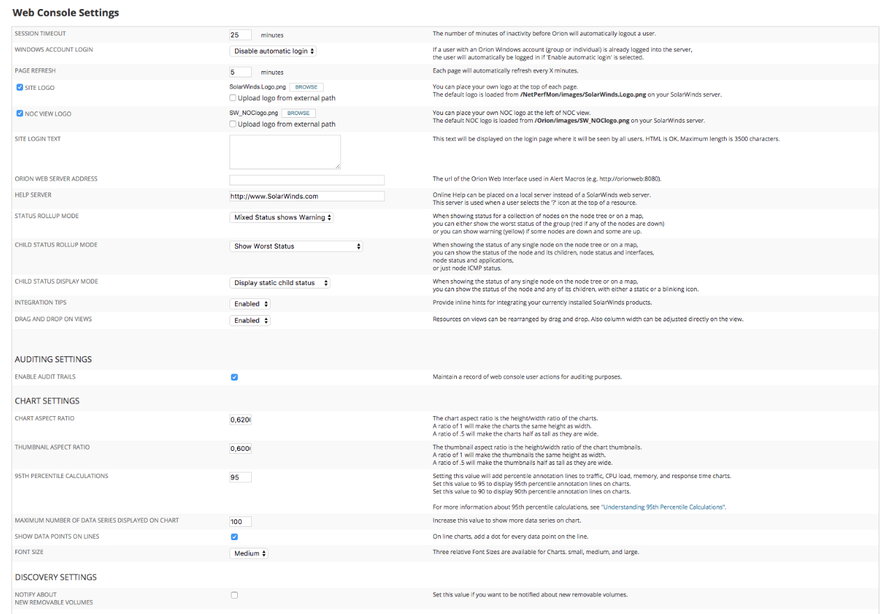
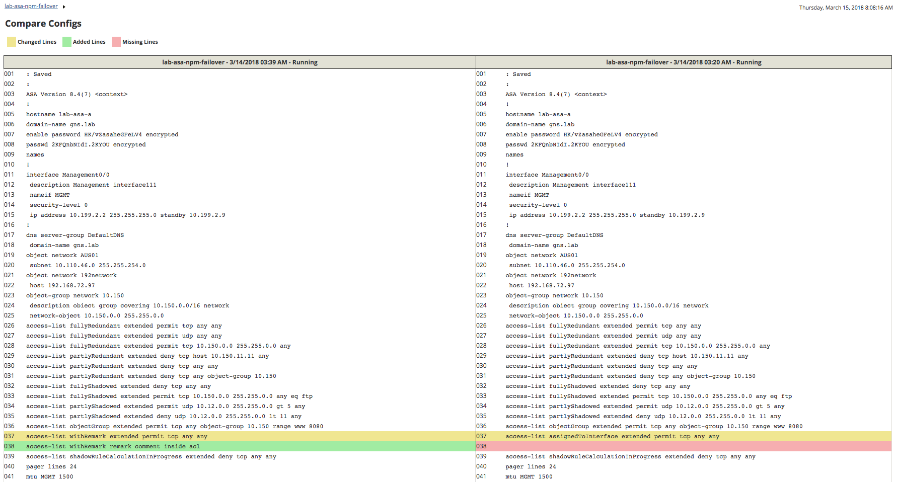
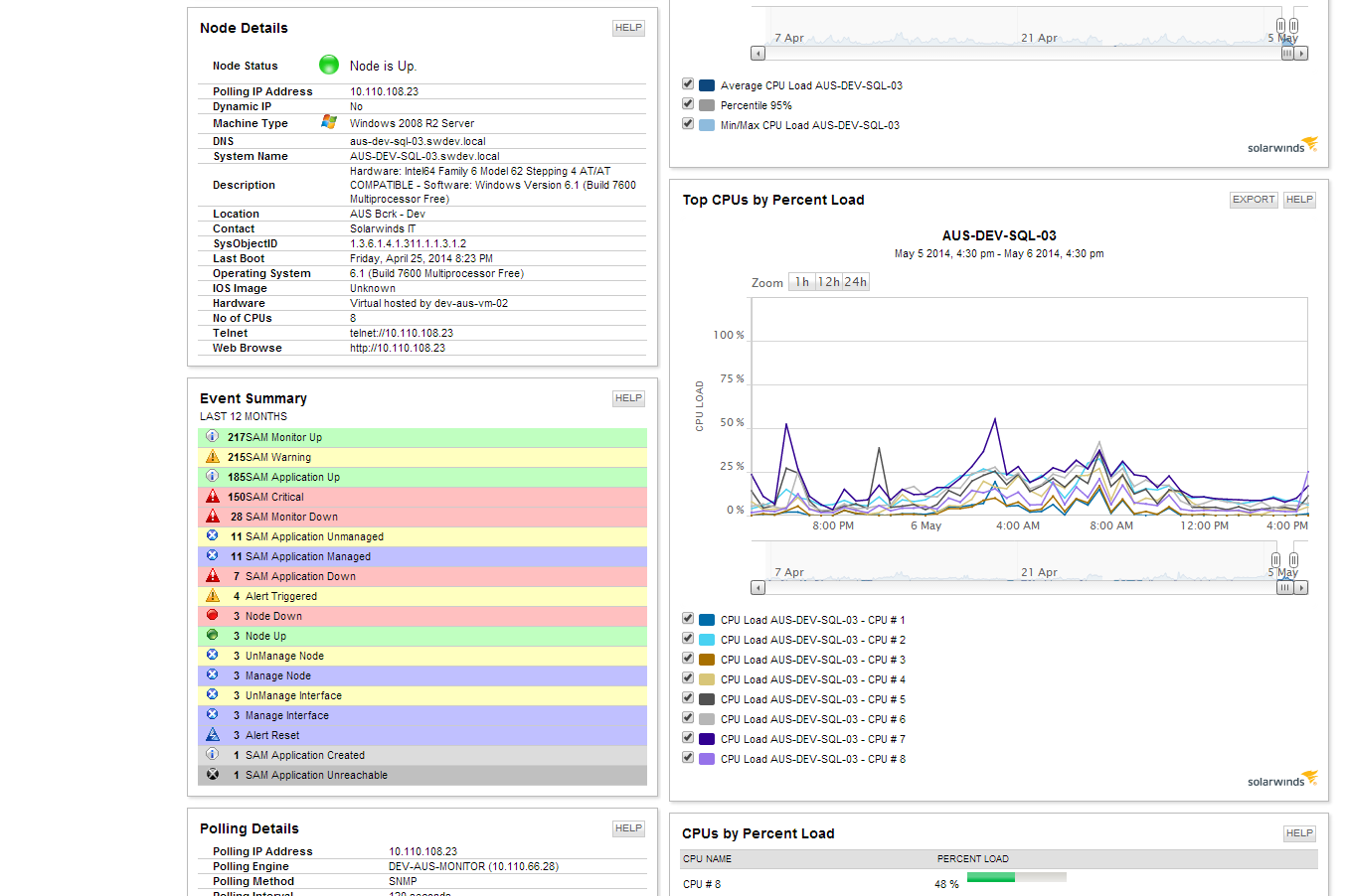
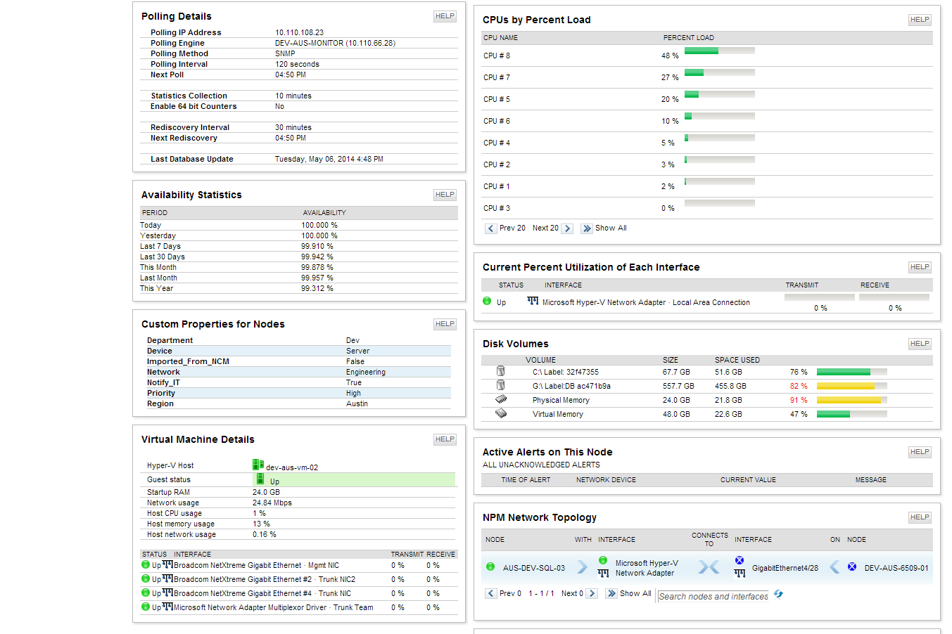
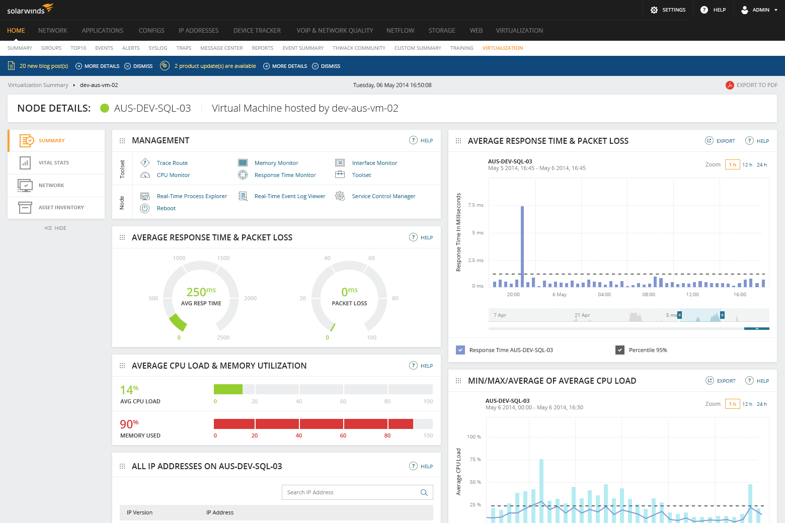
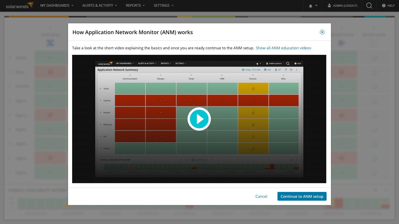
More legacy UI examples
I've collected few videos that illustrates various areas of the Orion platform and shows individual products (Orion modules, e.g. Server & Appliction Monitor, Network Performance Monitor, Virtualization Manager etc.). Feel free to click through these short videos from few years back so that you can get better understanding of how UI looked and worked. This privides you with better sense of how complex Orion platform is, how each product looks and works similar but still quite different, since each is developed by different product team etc.
2015 Server & Application Monitor (SAM) - introduction (3:14)
2013 SAM - setting credentials (2:13)
2013 SAM - Assigning app templates (7:05)
2013 SAM - Alerting and Reporting (2:42)
2015 Virtualization Manager - storage overview (2:31)
2015 Network Performance Monitor - Advanced alerting (4:53)
My role
In Phase 1 I was a key stakeholder and reviewer. Since phase 2 I was the Lead designer, active contributor and key stakeholder. I Elaborated on the initial visual design vision from phase 1 and dove into the tiniest details such as anatomy, look, feel and behavior. There was many iterations and improvements of the original visual concept. I Conducted reviews with engineering and design leads from individual Orion modules. I Closely cooperated with UX researchers on user feedback sessions. Closely cooperated with PO and 5 scrum teams on the UI framework implementation. In phase 2 and 3 I had 1 designer helping me full-time with design specifications, then 2-3 designers helping with the design system implementation and original content generation. Since phase 4 we scaled up design system related work significantly and I started to lead the design system initiative with about 20-member-wide international UX team (Brno, Edinburgh, Newcastle, Austin, Ottawa).
Project background
This was a really huge project to tackle. Orion IT monitoring suite encompasses cca 14 individual modules that can be standalone but also can plug into a single pane of glass monitoring platform. We tackled this project in multiple phases. We started with simple visual UI refresh and no UX and behavior changes, then we dove into more complex User Interface and Experience improvements. What started as a simple CSS refresh resulted into a brand new SWI-wide UI framework and SWI Design system that is consumed by product teams and designes, is actively maintained, updated and improved based on consumer and user feedback. Given the legacy tech stack, complexities of legacy products this is still ongoing project and trully a never ending story.
Phase 1: Simple visual UI refresh
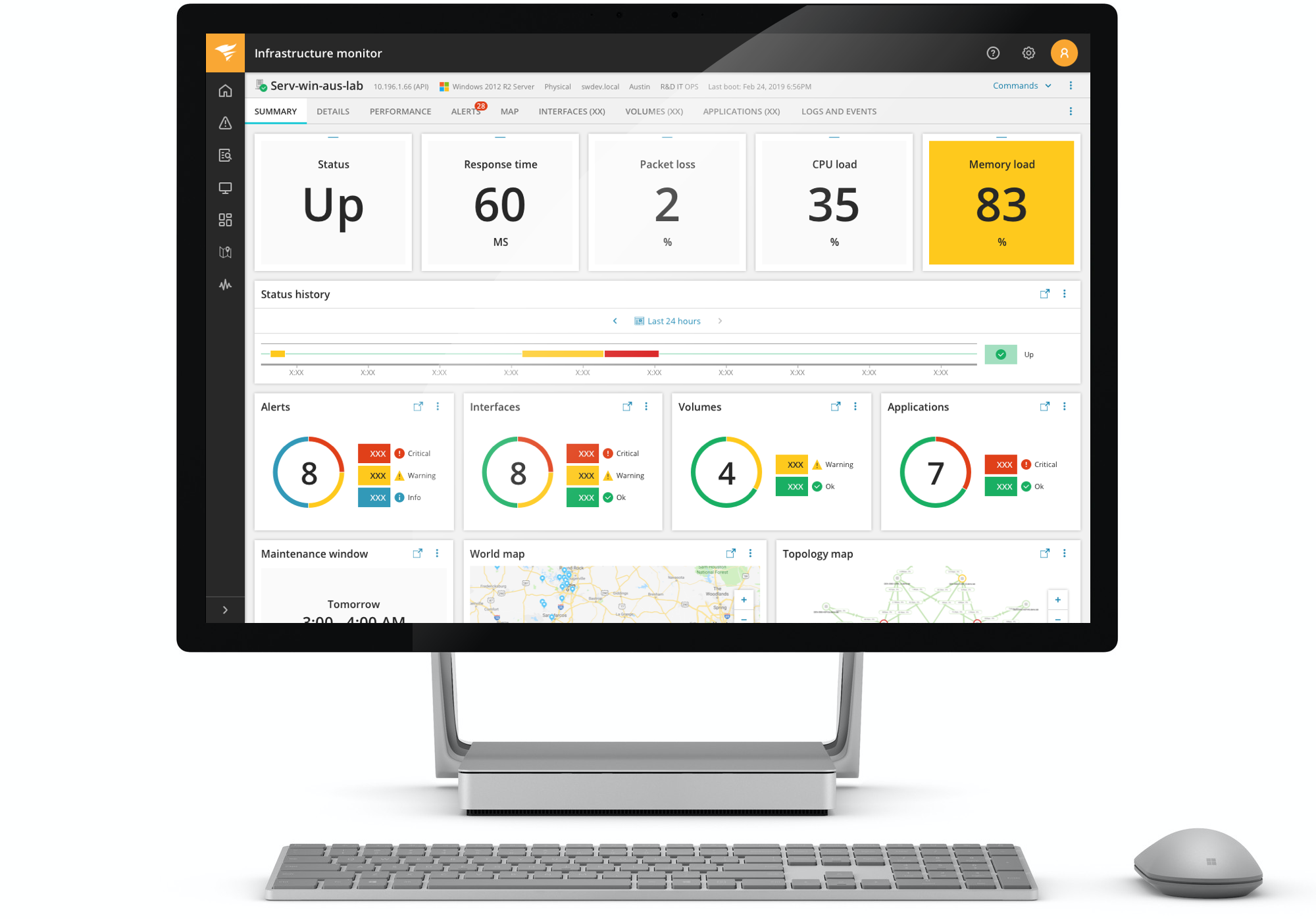
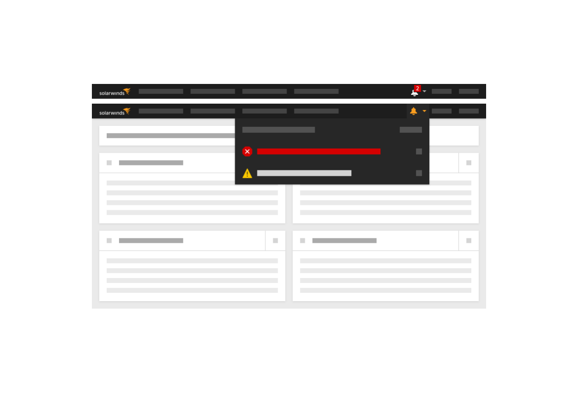
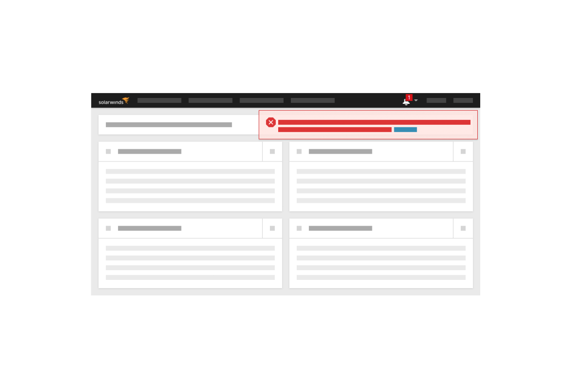
Simple CSS updates to the frontend made as fast as possible. No changes made to the actual backend. There was a lot of contrains of the legacy code. Internally we call this pase putting lipstick on the pig. Dedicated visual designer established a new vision of Orion Platform’s visual. Design went through multiple rounds of user feedback sessions and design iterations. Newly established UI dev team tried to implement as much as possible with the current code constrains. We did not fully achieve the desired design vision due to very limiting legacy code and various hacks from modules. Result of phase 1 was up-to-date look, redesigned main navigation and notifications. Optimized color palette, redesigned icons, deemphasized surrounding UI making the entity status and problems to pop.

Phase 2: Proper SWI UI Framework
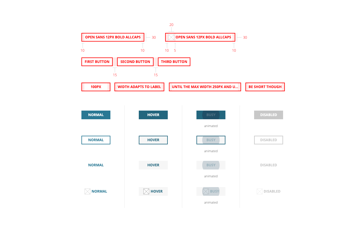
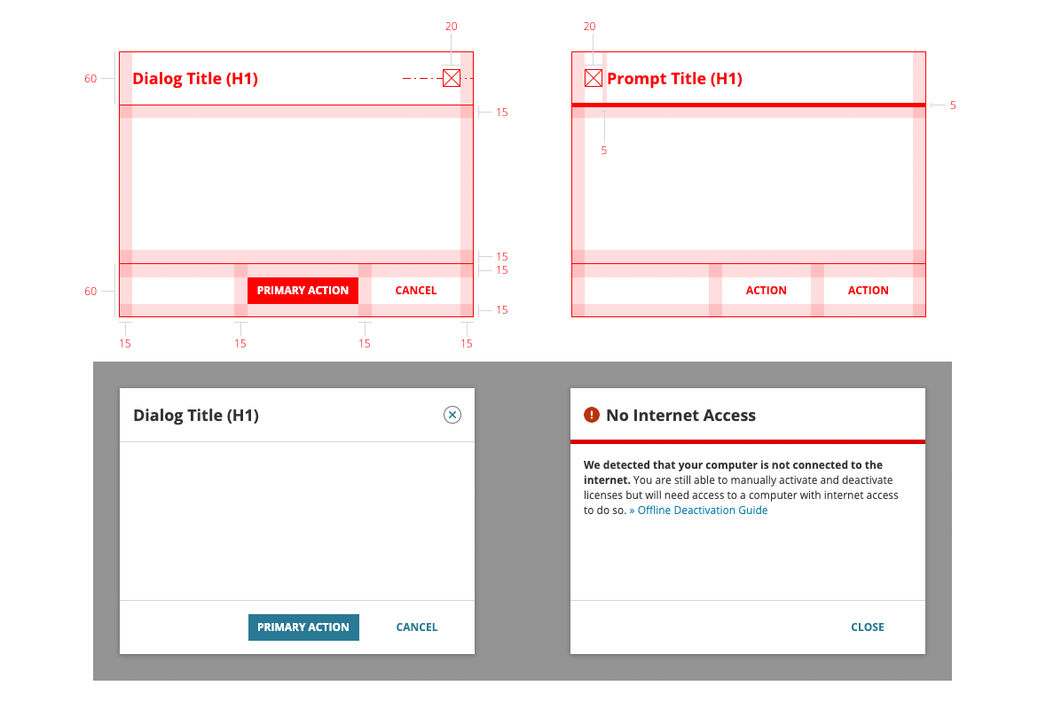
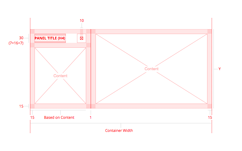
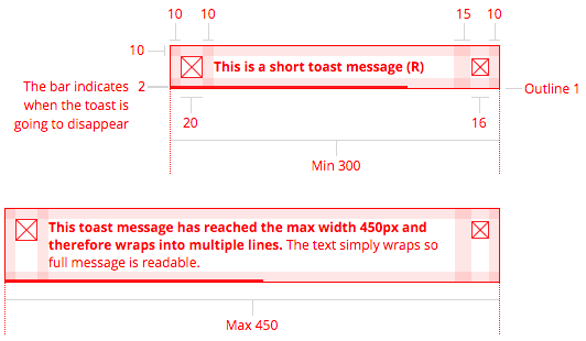
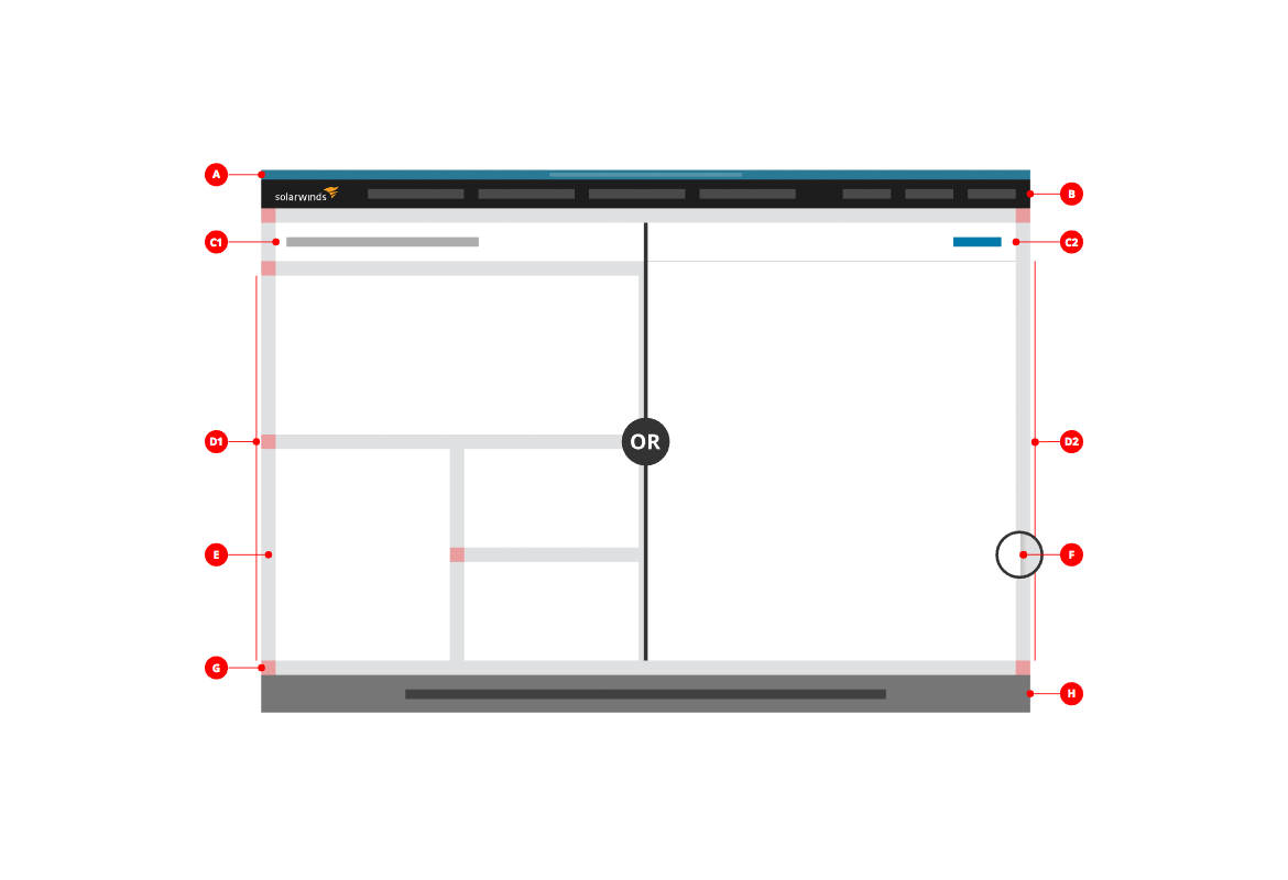
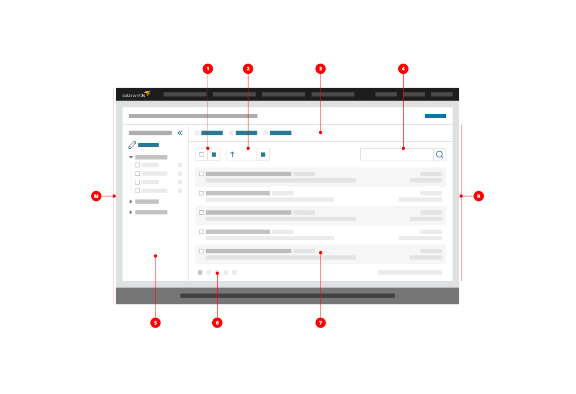
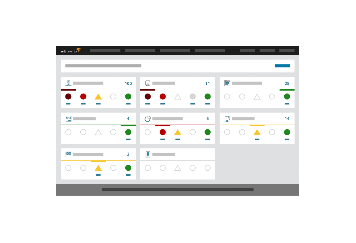
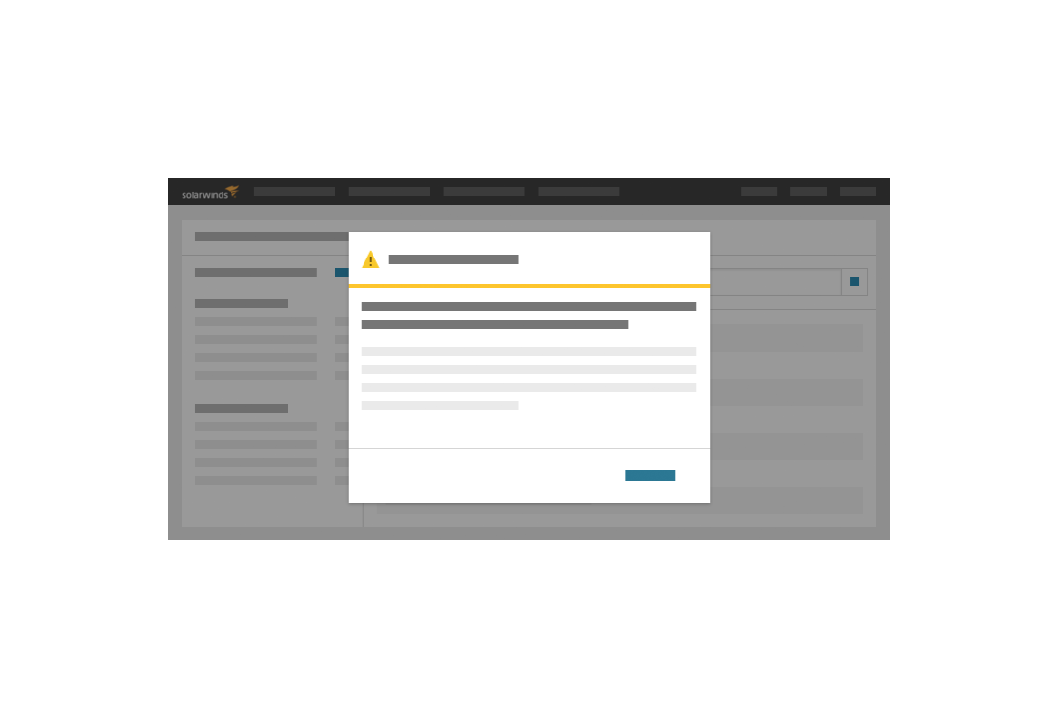
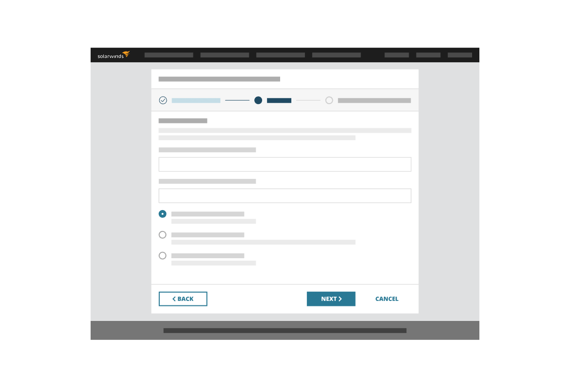
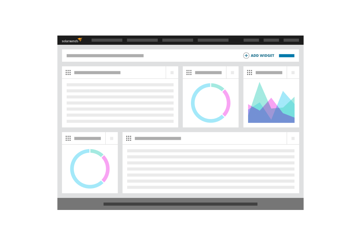
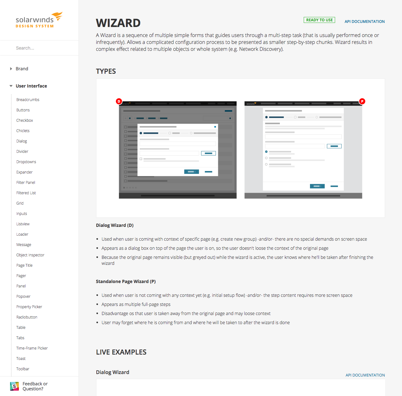
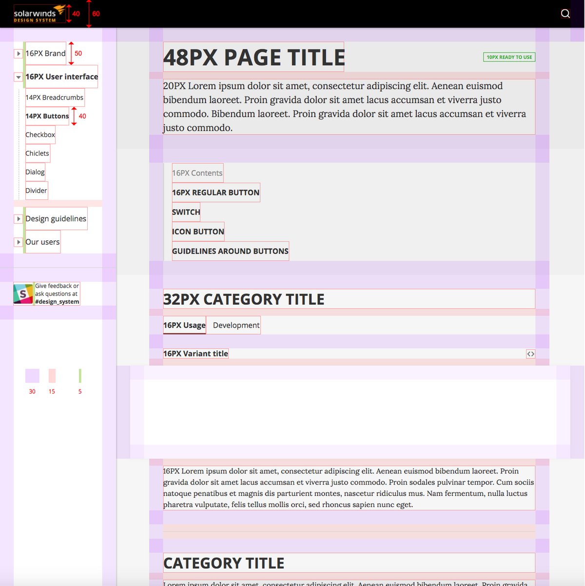
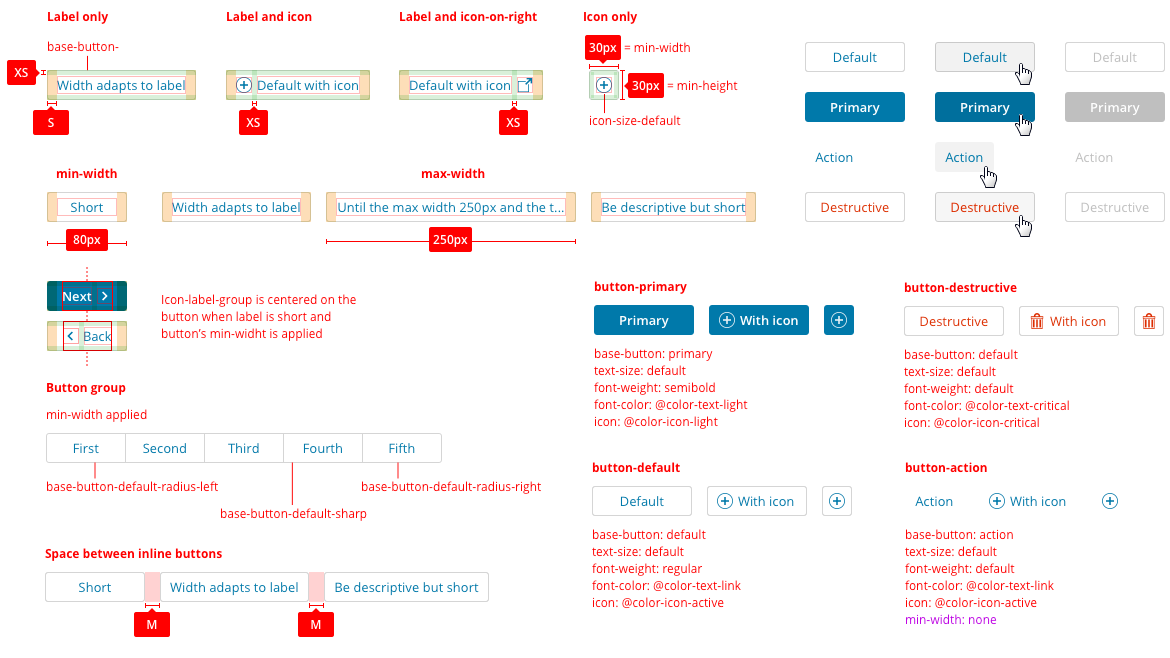
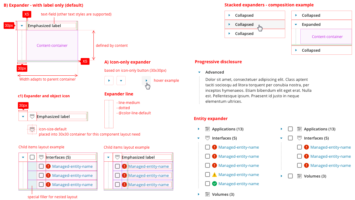
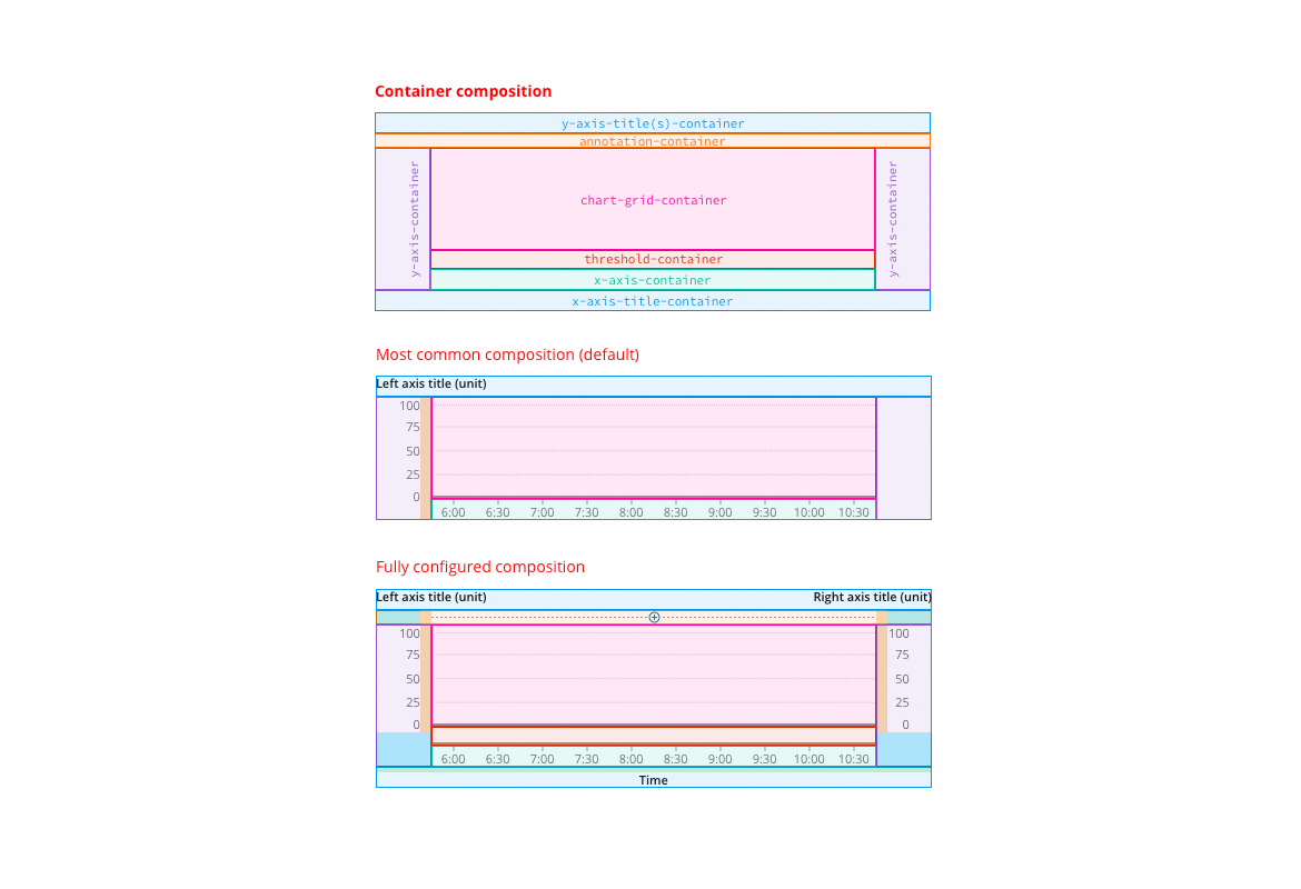
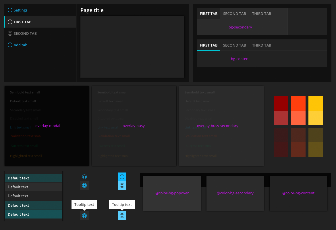
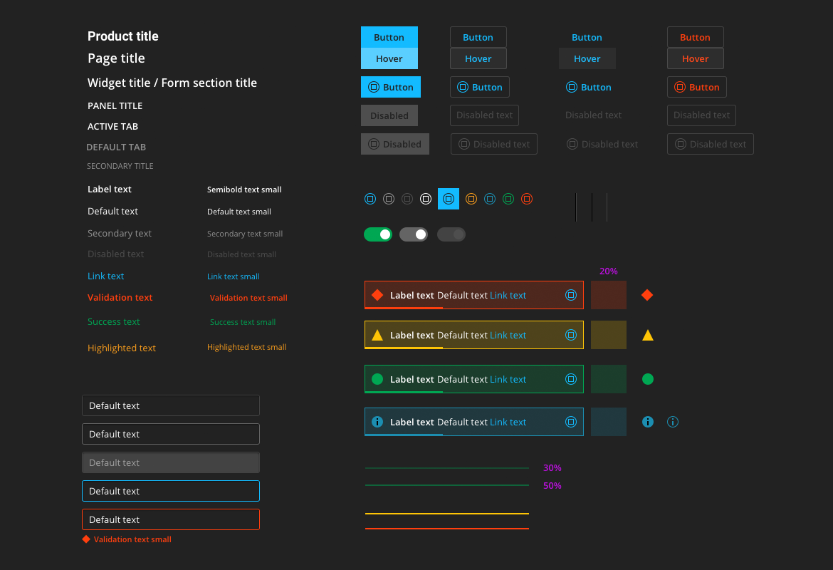
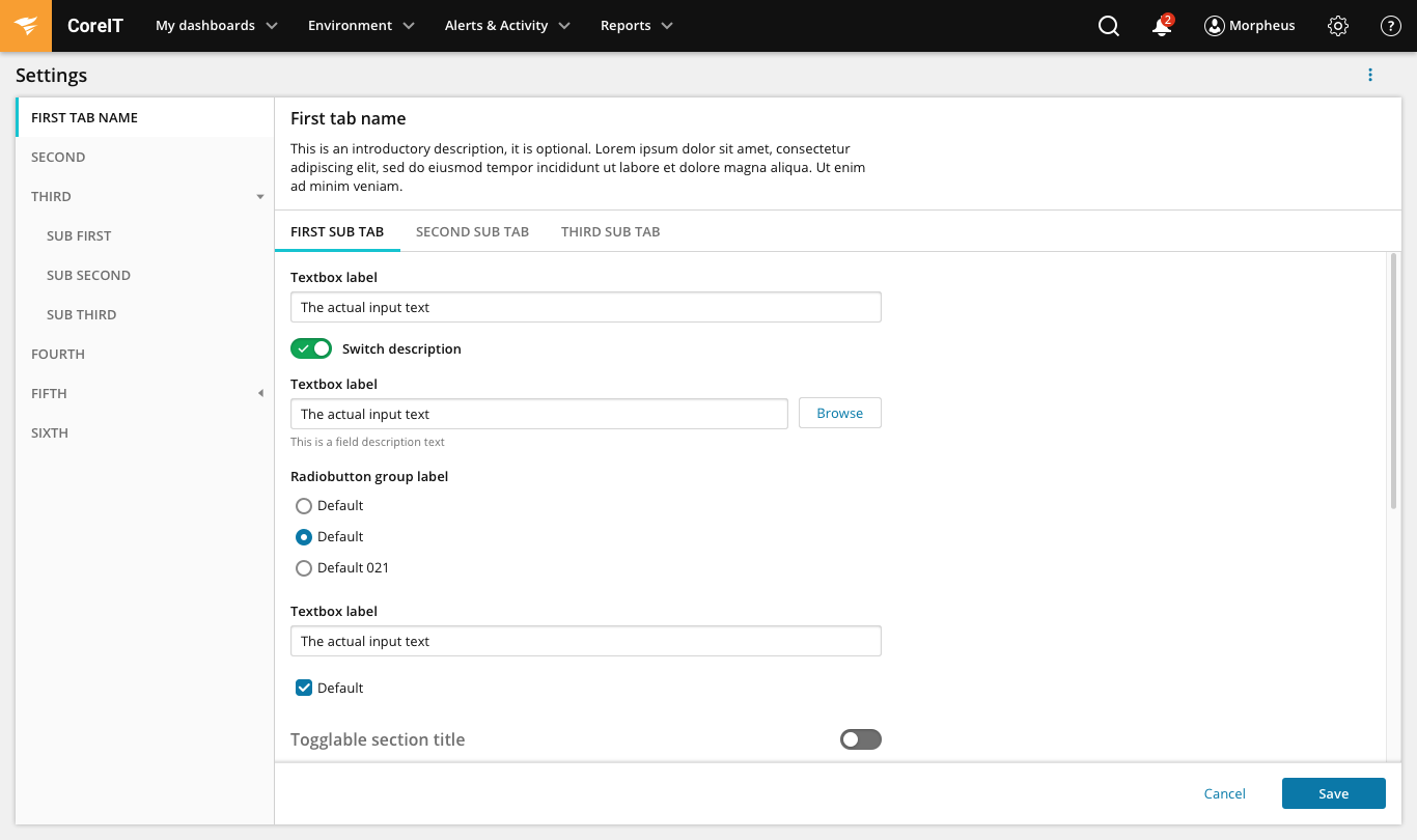
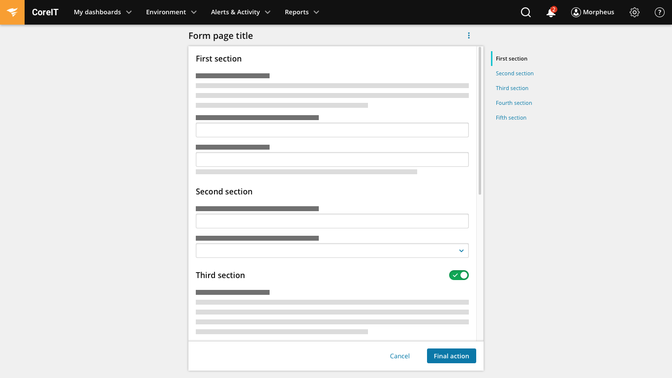
We have defined a brand new UI framework that is based on up-to-date technological stack. This was opportunity for big and impactfull UX improvements of individual UI elements, patterns and commonly used behaviors with no compromises due to legacy code. We’ve designed detailed specification of all individual atomic UI elements (such as Button, textbox, checkbox, expander, pager, sorter, list, tree, calendar, message, etc.), UI molecules (such as dialog, time-frame picker, filter panel, object inspector etc), UI solutions (such as asset explorer, filtered list, object selector etc.), page layouts (dashboard, object details page, form, error page, login page) and the UI dev team implemented them as a reusable UI framework.

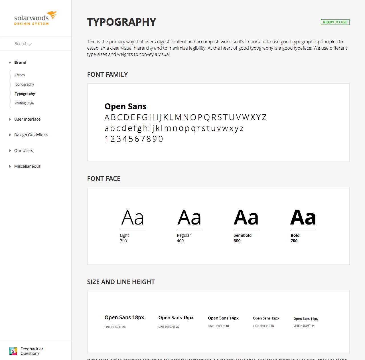
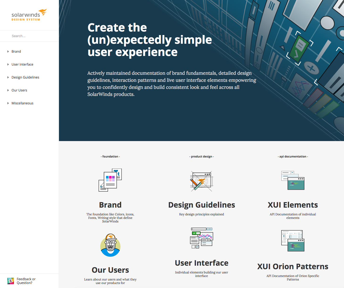
Phase 3: SWI Design System
At this phase we've put together a actively maintained documentation and catalog of brand foundation such as colors, typography, icons, voice and tone, UI elements and patterns, detailed design guidelines and interaction patterns. Initially we did not have a dedicated developer for design system thefore we created simple functional 1.0 version of SWI Design System just by utilizing the design team. We created simple Bootstrap, CSS and HTML based page that is loading live UI elements from SWI UI Framework.


Phase 4: Maintenance and iterations
Brand new products and new features are being built according to SWI Design System. Old UIs and products are migrated to the new UI framework on the oportunity-basis and tech-debt decrease initiative with business, performance and maintainability being the main drivers. This is true never-ending story, design system and UI framework is constantly evolving, being tested by product dev teams and real users. The feedback is incorporated regularly.


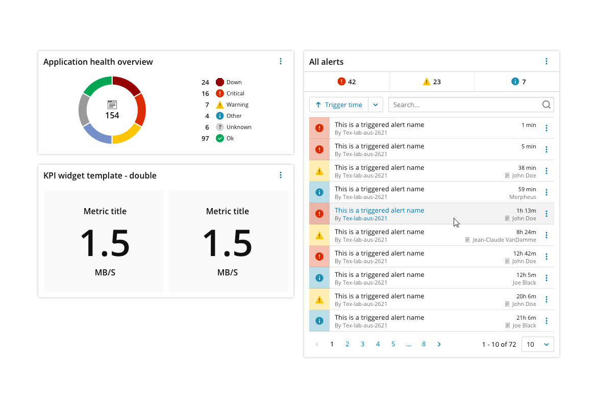
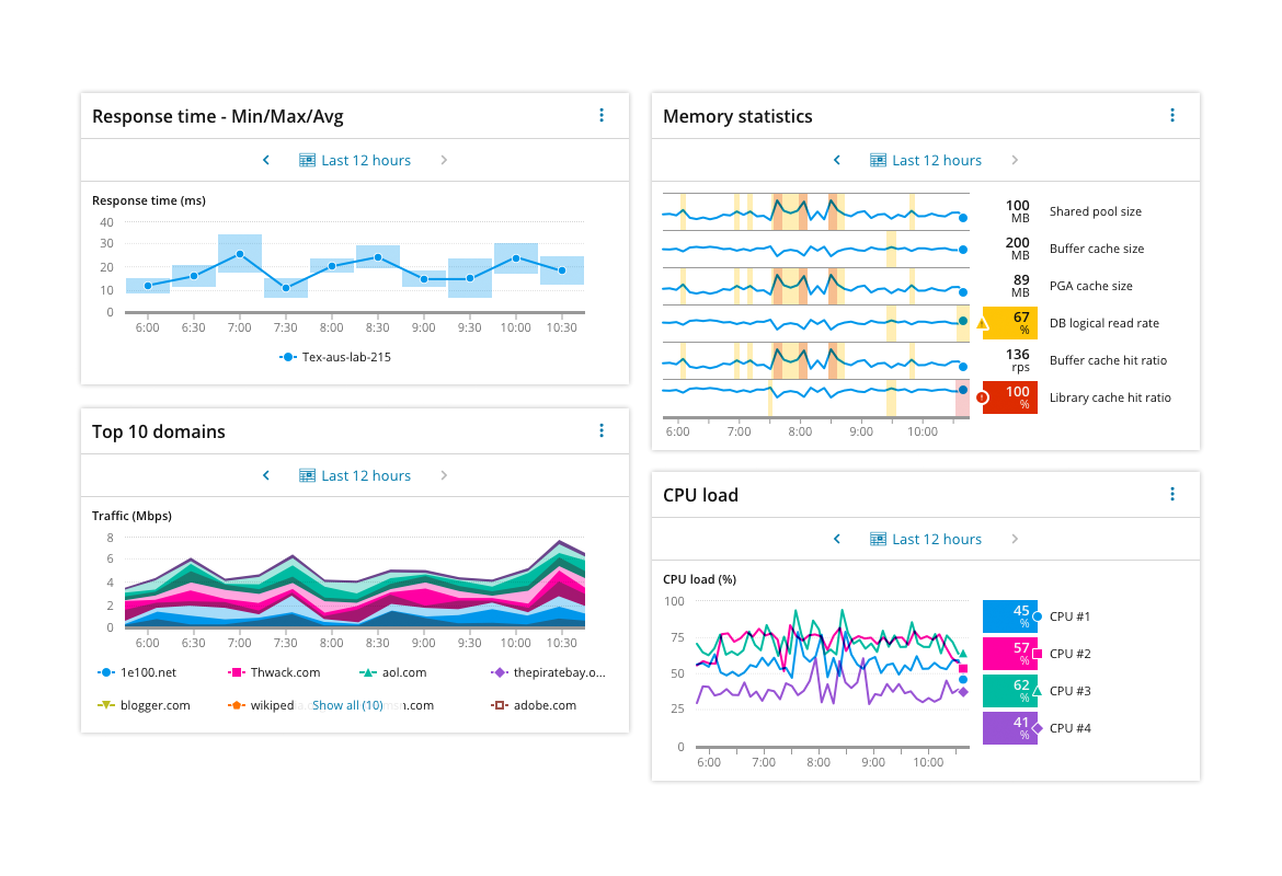
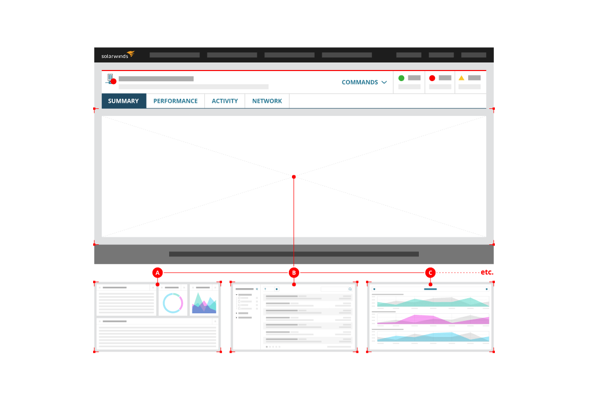
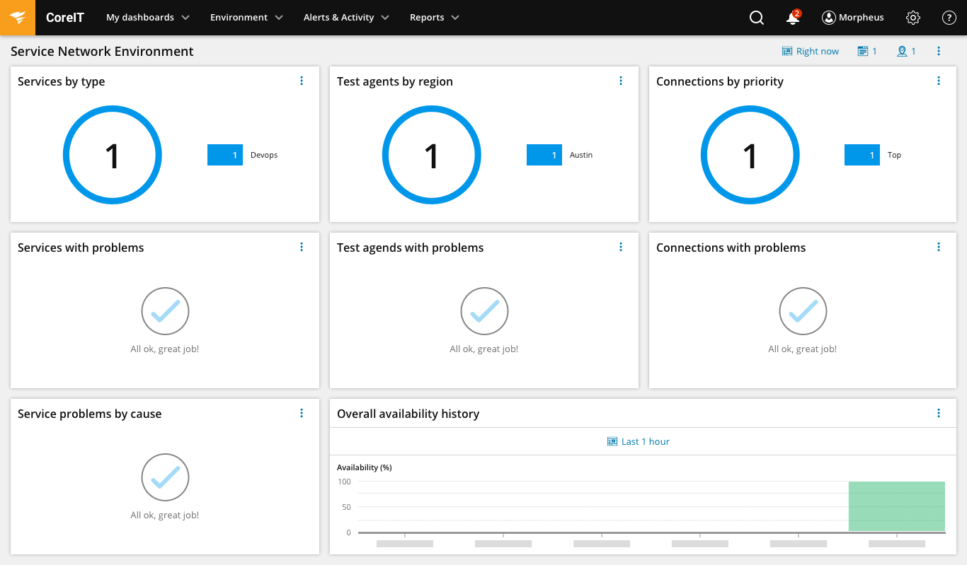
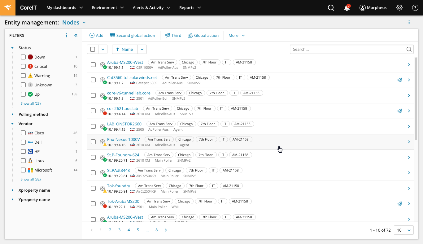
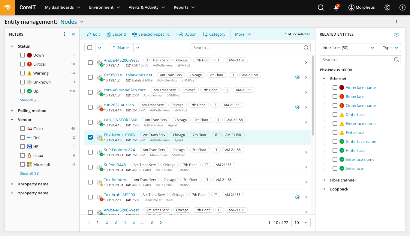
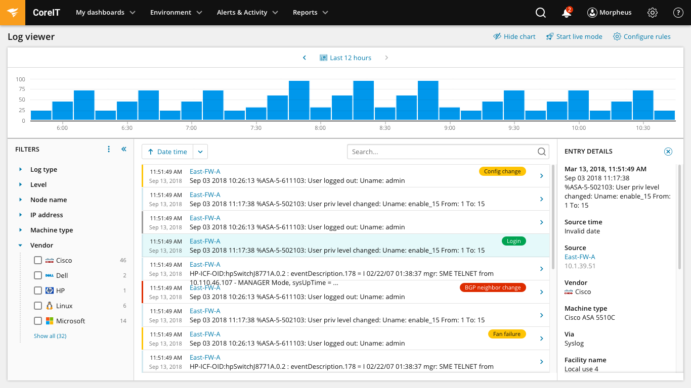
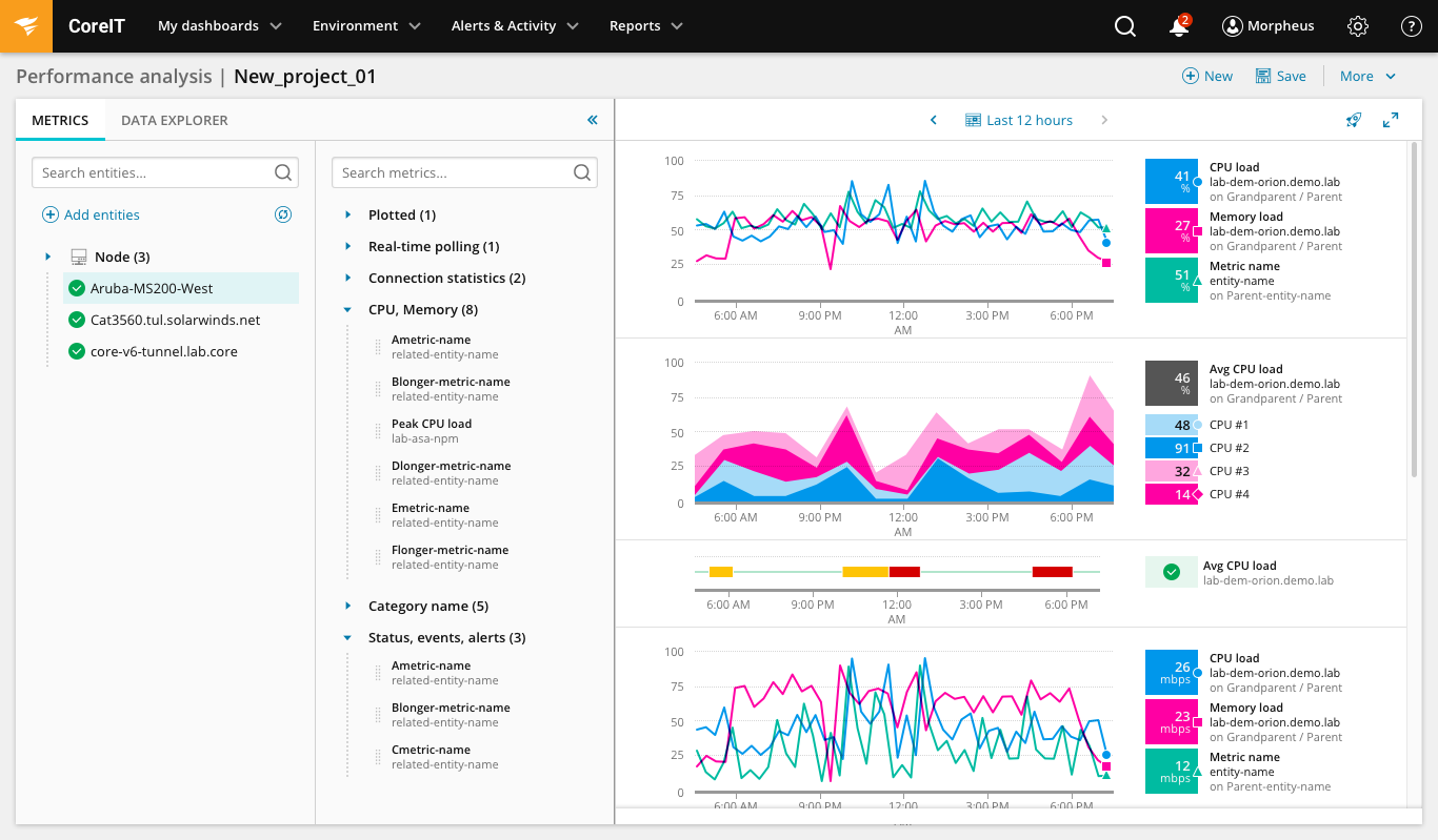
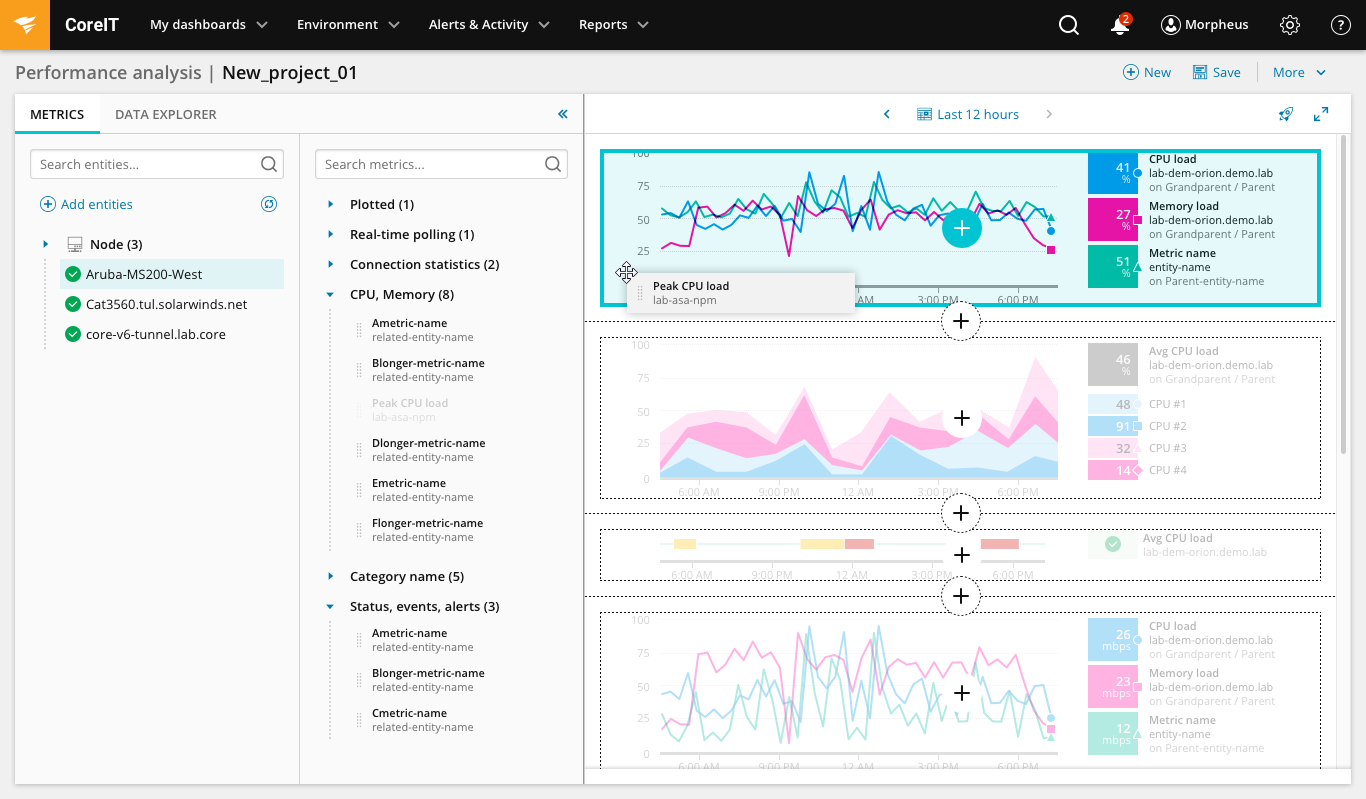
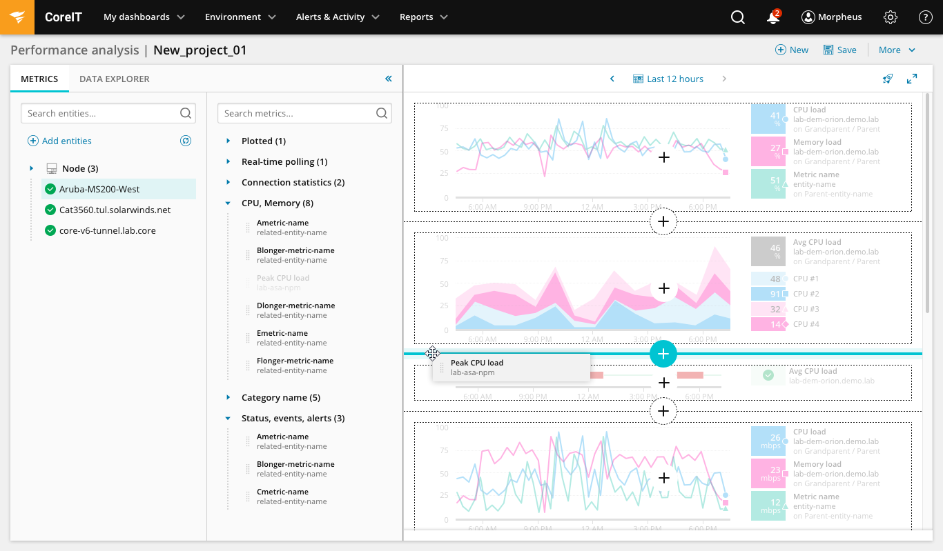
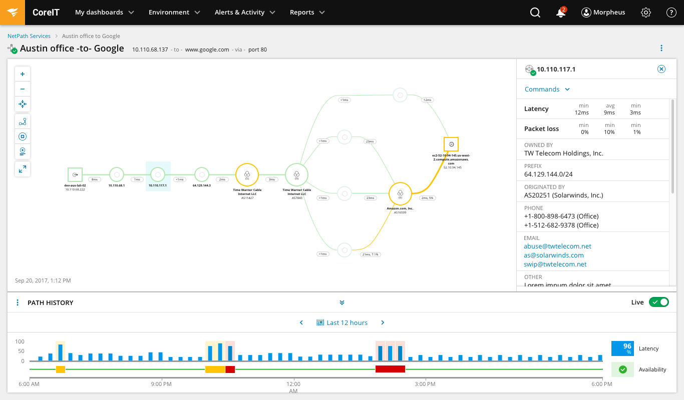
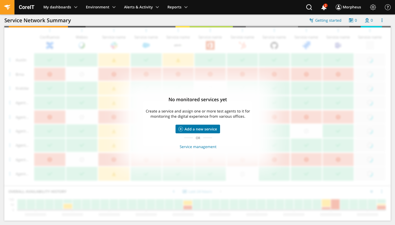
Resulting SWI UI Framework showcase
As menitoned earlier, the goal of the UI Framework and Design System was to unify the look and feel of all SolarWinds' products regardless of the business unit, which team built it, what designer designed it etc. so that customers get cohesive and intuitive user experience.


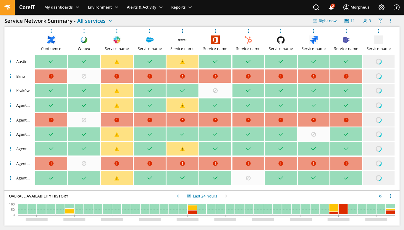
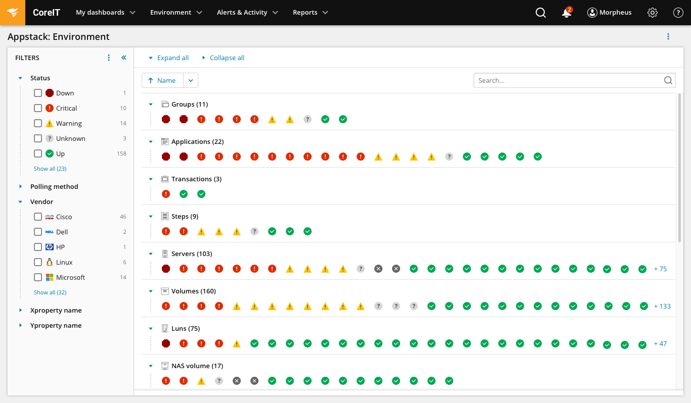
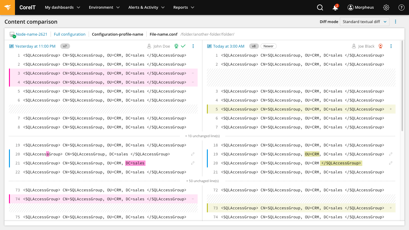


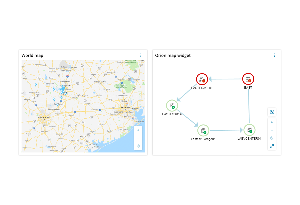
Product adoption showcase
Here is a showcase of some of the products that already built by the new SWI UI framework and follows SWI Design system best practices, patterns and UI solutions. On brand new products you can see the results so quickly! Unfortunately for core and complex legacy Orion products such as Network Performance Monitor, Server & Application Monitor, Virtualization Nanager, Network Configuration Monitor etc. it is still going to take years untill the whole product fully adopts the new UI Framework if at all. This purely depends on business priorities and long term business strategy. But hey, we as a design team make baby steps towards awesomeness...
Security Event Manager (2:13 min)
NAT Lookup Free Tool (1:07 min)
SQL Plan Warnings - Free Tool (0:58 min)
Flow Tool Bundle - Free Tools (1:15 min)
Log Analyzer (1:28 min)
Access Rights Auditor - Free Tool (1:34 min)